

.svg)

.svg)

Typically, when we refer to the words “interior design”, we immediately think of furniture, colors, styles, trends, and aesthetics. However, if we take all this holistically, you’ve got it – interior design psychology.
We go through days when we’re feeling more energized and days when our mood is low. There are some days when we feel more calm, and others more angry, and most of the time, we don’t know the reason why.
Part of that reason resides in the spaces where we live, work, and exist. The truth is, the areas that become our living spaces have an incredible psychological effect on our subconscious.
You are already familiar with that almost incomprehensible need to clean up your work desk so you can think clearly. Yes, mental and space clutter are coexistent. And that’s just one piece of the puzzle.
There is a certain science behind a happy home – design psychology. It has two main components – the way your house can contribute to your well-being, fueling your anxiety or calming you, and the messages your home can send out to other visitors.
The Role of Objects in Interior Design Psychology
French sociologist, and cultural theorist, Jean Baudrillard has expressed the idea that every item we choose to fill our space with has a symbolic value, in addition to its exchange value.
More than that, every object, from the tall lamp in your corner to a coffee table or chairs, are an expression of our desires and personality. When we invite guests to our home, they will try to assess the interiors on four main criteria:
- Function (“Is the type of flooring right for this type of area? Are there enough chairs around the dining table?”)
- Money value (“How much is this item worth?”)
- Symbolic (“Does this specific artwork hold any emotional value?”)
- Sign (“Is this a well-established brand/designer I should know about?”)
This type of evaluation will also reflect back to the owner of the place and their self-esteem. Truth be told, our homes are a message to the outside world and a cradle of functionality and emotion for our inner world. The happy houses are those that have this perfect balance, and it is not difficult at all to achieve this balance.
Let’s discuss space and color, and you’ll see.
The Perception of Space in Design Psychology
Interior design is not about the space you have; it’s how you use it. Our perception is a magical thing. Sometimes, it can deceive us, but for the better.
Space can be manipulated to such a degree that we can feel we live in a castle, not in an apartment.
Mirrors or window walls create an immense sense of space. Slim, scaled-to-size, “floating” furniture will make any room seem larger than it is. Wall hangings can create fantastic depth.
Warm color pallets and ambient lights are also desirable in small places. They create that cosy sense of safety and “home” – like you need nothing else in the world.
Windows let in a lot of natural light and an openness to new possibilities.
But how about the colors?
The Color Psychology in Interior Design
Color psychology has a crucial impact on our mood every day, and most of the time, we don’t even realize it. Various tones and nuances stir up multiple emotions in us, from serenity to passion. So, choosing the colors for your home should be more than just a matter of preference or trends.
Truth be told, you might prefer a color today because you’re in a certain mood. However, in a few days, you might favor another one, and so on, you fall into that problematic trap of choosing the color for your house. We’ve all been there, interior designers or not.
So, here’s a quick guide to what colors tell us and how they influence our mind and soul.
Color can generate a whole experience for us, and it is one of the most valuable instruments in interior design. Let’s take a peek at what colors whisper to us every day in our homes.
Pink and Yellow
Pink in interior design is unfortunately associated almost exclusively with little girls’ rooms. However, there is more to pink than meets the eye.
In color psychology, pink is the color of sensitivity, nurturing our mind and calming our souls. It can be delicate, subtle and comforting in its many hues, making it perfect for bedrooms, living rooms or even kitchens.
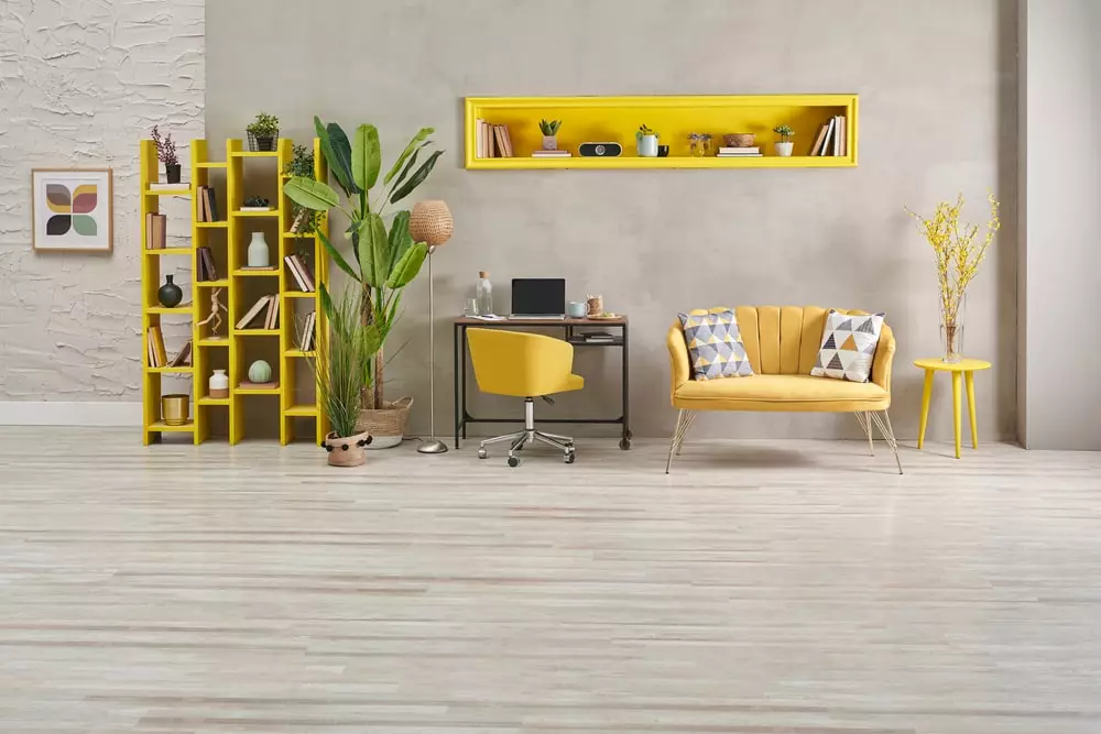
Yellow is usually associated with a deep focus for mental activities, energy, joy and optimism. It is a very versatile color, and it appears in a lot of interior design mood boards.
From mustard to lemon or even baby yellow, there are many popular yellow hues that you can experiment with, either in your kids’ room or in the living room.
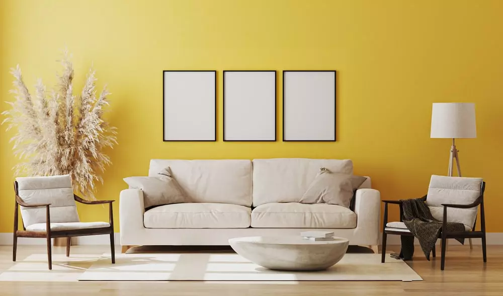
However, yellow is usually a bright tone. That is why we see this color mainly as an accent, a statement – a piece of yellow furniture here like the blessing rays of a vernal sun, a bold yellow wall there to brighten up your mood… you see it?
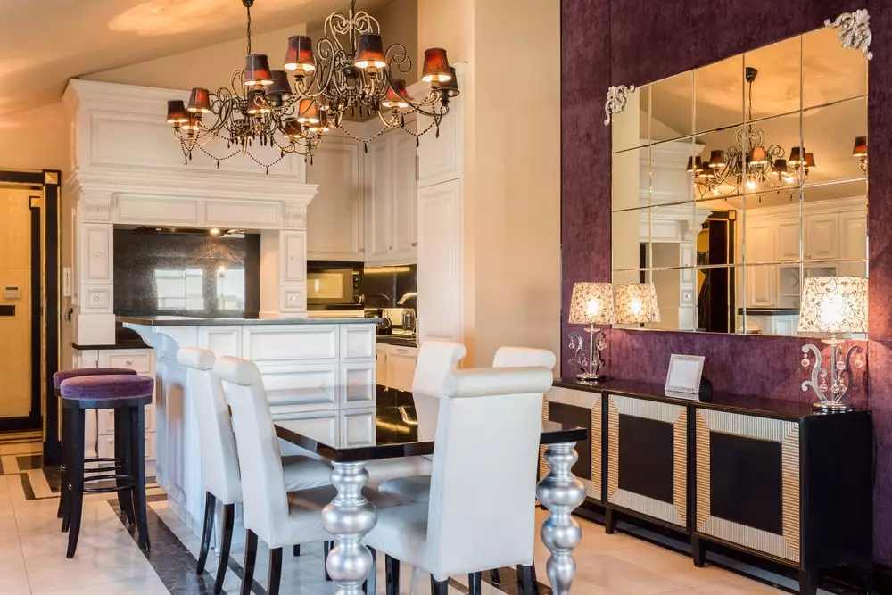
Blue and Purple
Blue is a strong statement on any mood board for interior design. It can be both bold and calm. For example, royal navy is a blue hue that conjures up confidence and clarity.
On the other hand, light tones of blue infuse tranquillity and serenity in our lives, making them great for relaxing living spaces.
Historically, purple has been associated with nobility. Maybe our ancestors were also aware of color psychology, or just listened to their senses, and felt that purple radiates a sense of wealth, luxury with a touch of fantasy. And that’s what royalty is all about, right?
Well, wealth is, in a sense, more than the accumulation of riches. It is also inspiring creativity, imagination, mystery. Lighter notes of purple are incredibly feminine, but darker tones exude masculinity.
Yes, that regal charm never seems to fade away, no matter how you look at the purple color. However, an entire interior in purple notes can be pretty tiresome on the eyes and mind. So you might want to tone it down a bit with shades of white or cream.
Black and Grey
Yes, technically, black is not a color. It is a mix of pigments that reflect so little light that you cannot see any color – just black.
Black plays a prominent role in most of the world’s culture, and it is usually associated with something negative, menacing. Nevertheless, in design, black is considered the epitome of elegance. They say you can never fail with a little black dress.
Even so, in interior design, black is usually shunned. Black walls are deemed depressive. They are a bit tiresome, yes. However, in the right combination, black in interior design can be exquisite, sleek, sophisticated, with a pinch of drama.
You can always tone it down with a bit of brown and notes of grey.
Talking of grey, here’s your multi-faceted personality chameleon. Grey is such a versatile color that can fit in almost any environment. It exudes security and a sense of safety, familiarity.
It can tone down powerful, intense colors like black, purple or red, ideal for family homes.
Yes, in excess, it can become a bit dull. So, please don’t overdo it.
Brown and Green
Nothing beats the color brown when it comes to natural comfort and structural relaxation, comfort and beauty.
Mainly because it is the color of wood, we associate brown with the idea of home and the comfort that it brings us. It speaks of stability, support, permanence, legacy.
It can be luxurious; it can be old-fashioned, rugged and natural; it can be shabby chic, masculine, natural. It can be almost everything you want.
So, how about green? It’s another color that evokes nature, right? Well, it very much depends on the hue of green we’re talking about.
Lighter shades of green give you a certain sense of balance and growth. It can stimulate and nurture your sense of equilibrium. However, in darker tones, it’s incredibly luxurious and noble.
We could say that green has more than one shade. Jade, emerald green, olive or lime are the perfect colors for home studies, or kitchens, while darker tones are ideal for offices, as they’re linked to money and wealth.
Such an exciting color!
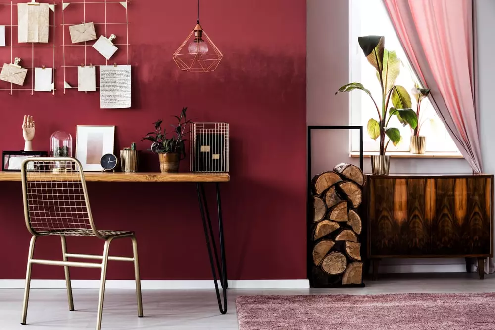
What about red?
We couldn’t end this article on the psychology of interior design without discussing red. It’s a vibrant, exciting color, full of energy and ambition.
In interior design, a red color scheme is highly daring, provoking and dramatic. It rouses emotions. You cannot be neutral when you see red. See what we did there?
Red can be a very productive choice of color. It is the color of blood, of fire, and that’s what it brings to our lives – a drive to do, to be.
It is also extremely sensual, and in certain shades, such as burgundy, it exudes luxury and wealth.
All these Details Make the Design
Yes, there is this quote going around on the internet – “The details are not the details. They make the design”. We don’t know for sure who said that, but it’s genius.
In our daily hustle and bustle, we might lose ourselves, and a happy home is that place where we find ourselves. That is why all these details matter, so we should start thinking about interior design psychology more often.
.svg)

